Project Overview:
TerraMeat is a brand new, revolutionary plant-based chicken alternative. When I was brought onto the team at Elmhurst I was tasked with ideating on how to bring this brand to life.
Scope:
The project involved creating packaging and branding, an extension of the Elmhurst website that could feel like it's own website, and standards that could be used across social, ecomm, trade and more.
My Role:
I played multiple roles in developing this brand. I created a lot of the initial ideation for a variety of different directions while the team explored names and sorted out what the priorities were for the brand. I created the general direction for the brand, and a rough draft of the packaging before it was polished by another designer. The logo was pulled from work a previous designer with the company did. I was able to lead the design and direction of the ecomm site, as well as the product photoshoot for launch, and the initial planning for social media content.
Branding:
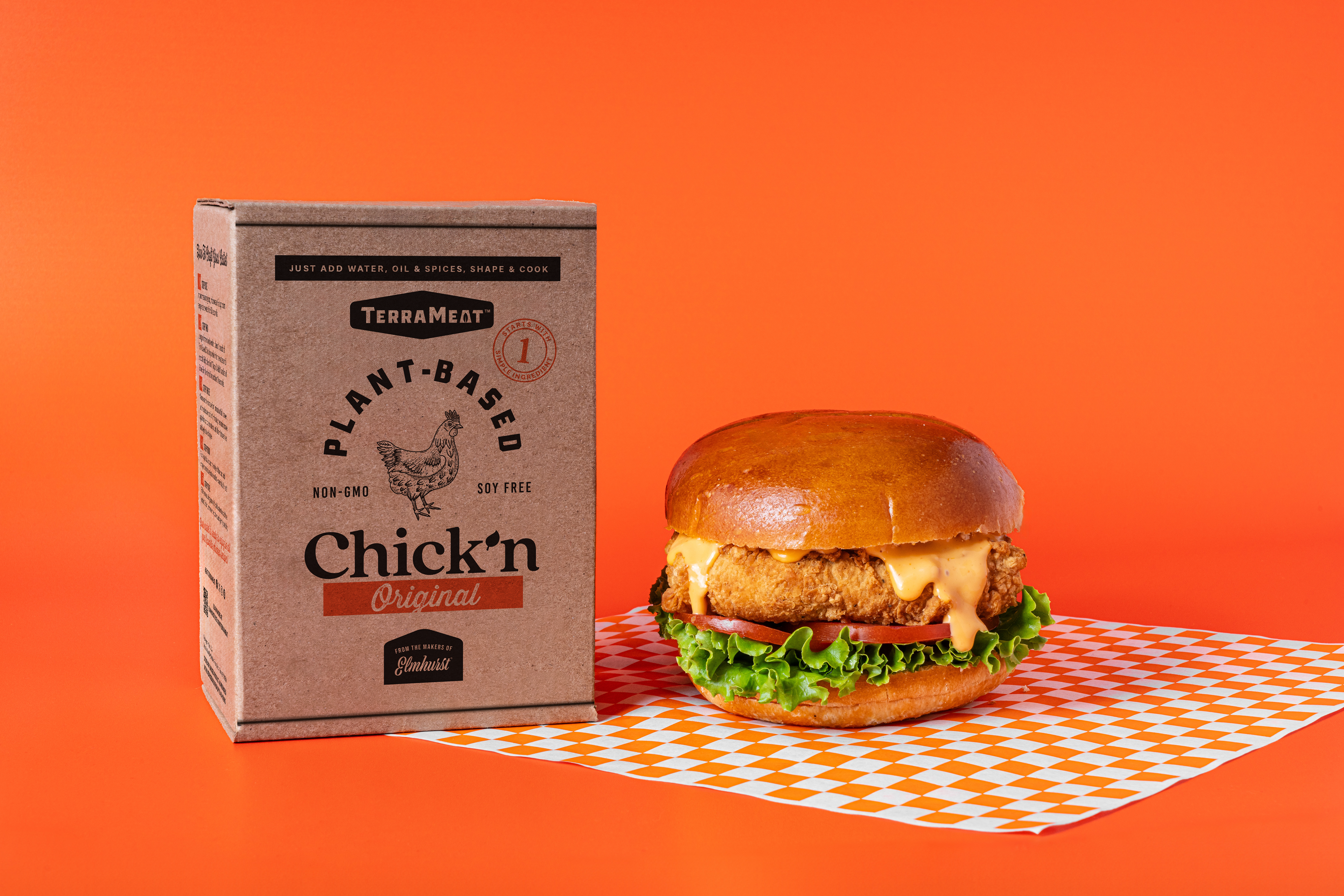
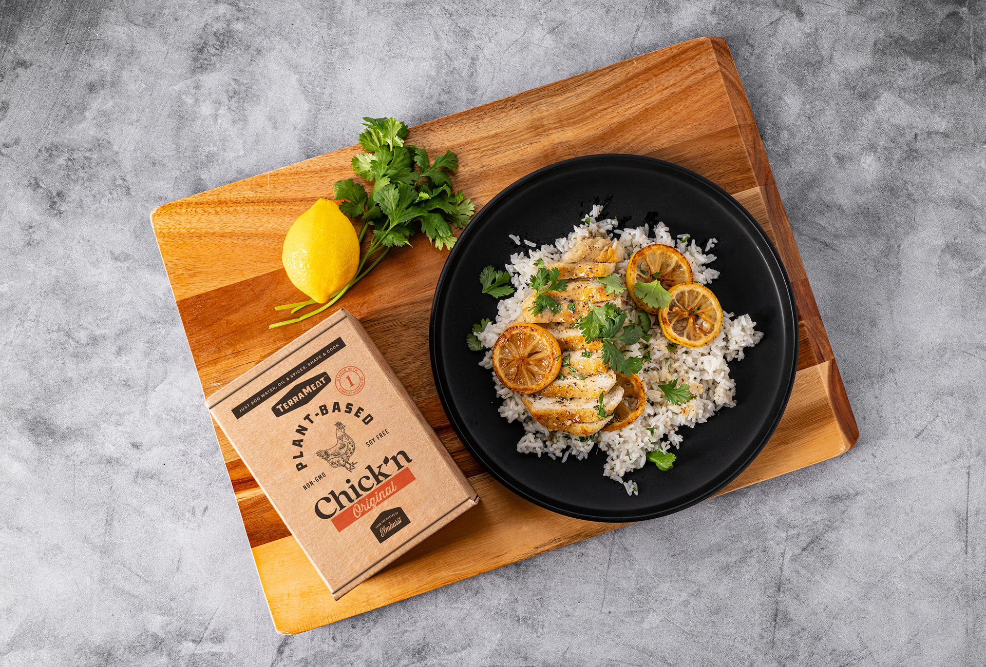
Utilizing an existing logo from a previous designer, I chose to develop a visual identity for TerraMeat that was reminiscent of a classic butcher. This idea was inspired but a product name idea thrown around during the development, The Benevolent Butcher. Since we're releasing a product that's entirely new and foreign to consumers, I wanted to bring in elements that were familiar and associated with what we're trying to create a better substitute for, meat. The branding utilizes warm tones like oranges and yellows, butcher paper texture, a checker pattern that reminds you of that classic paper you get with a basket of wings, and lots of vintage inspired badges and stickers.
Ecomm:
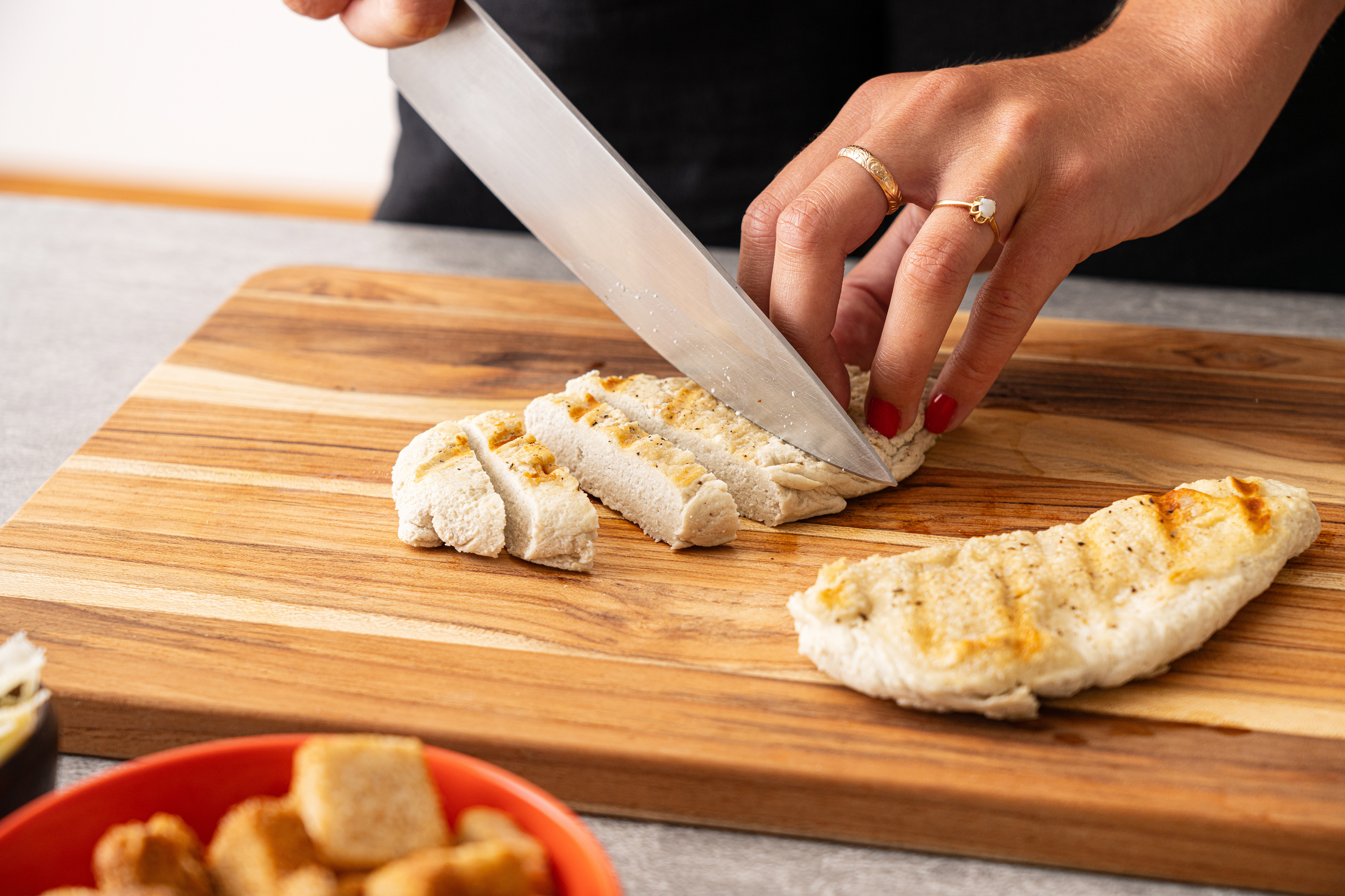
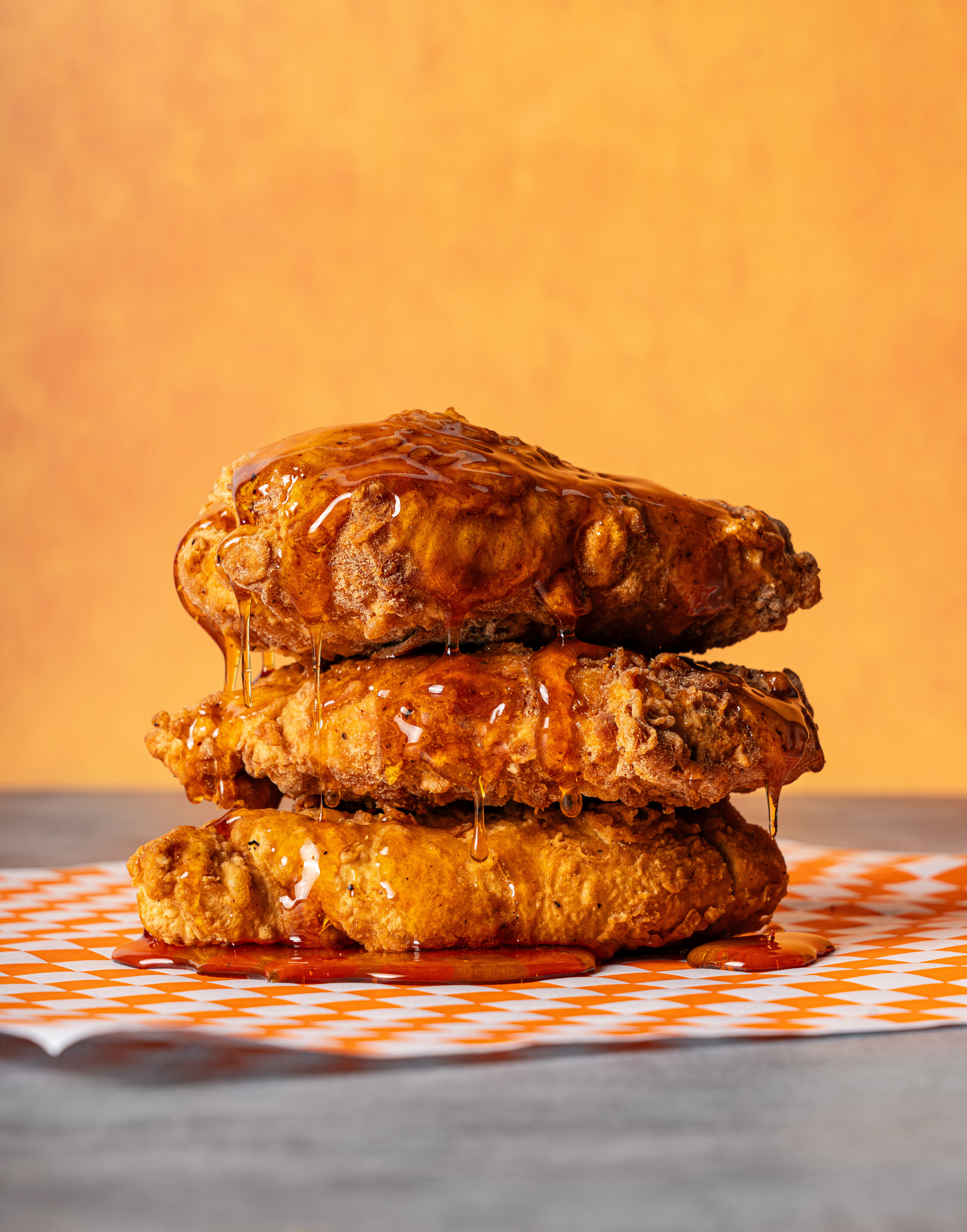
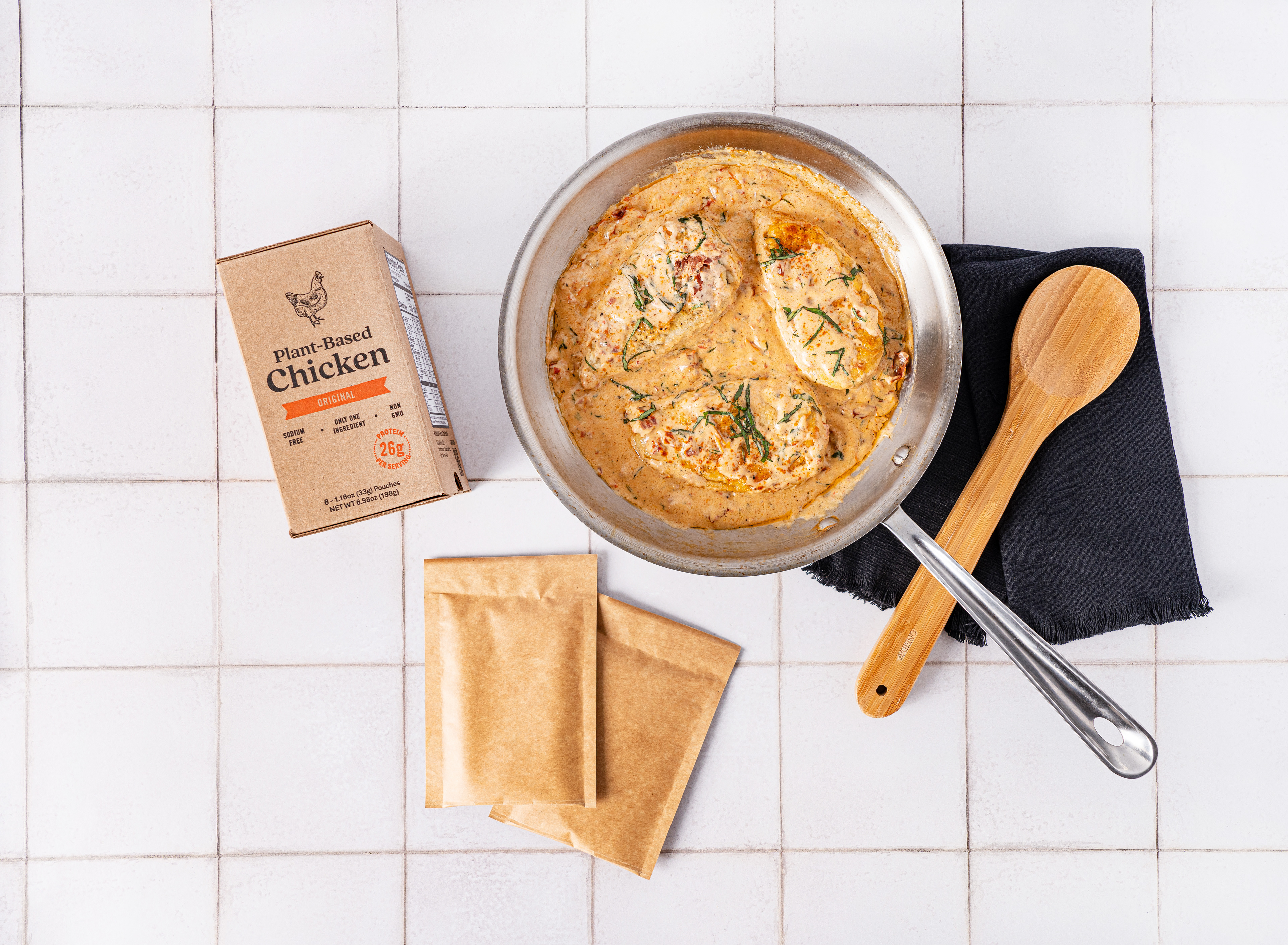
With the help of our web developer, we brought to life a web presence for TerraMeat that is bold, filled with juicy images and retro-inspired stickers.
Social Launch:
In discussing how we launched this brand we decided we really wanted to have some mysterious pre-launch content to try and create some chatter and excitement about the launch. This was done through a 9 grid of exciting callouts and selling points, without revealing the final product. I also pitched the idea of a fun, silly, informercial style video to lean into the idea that we're launching an amazing product that will solve all our customers existing problems.
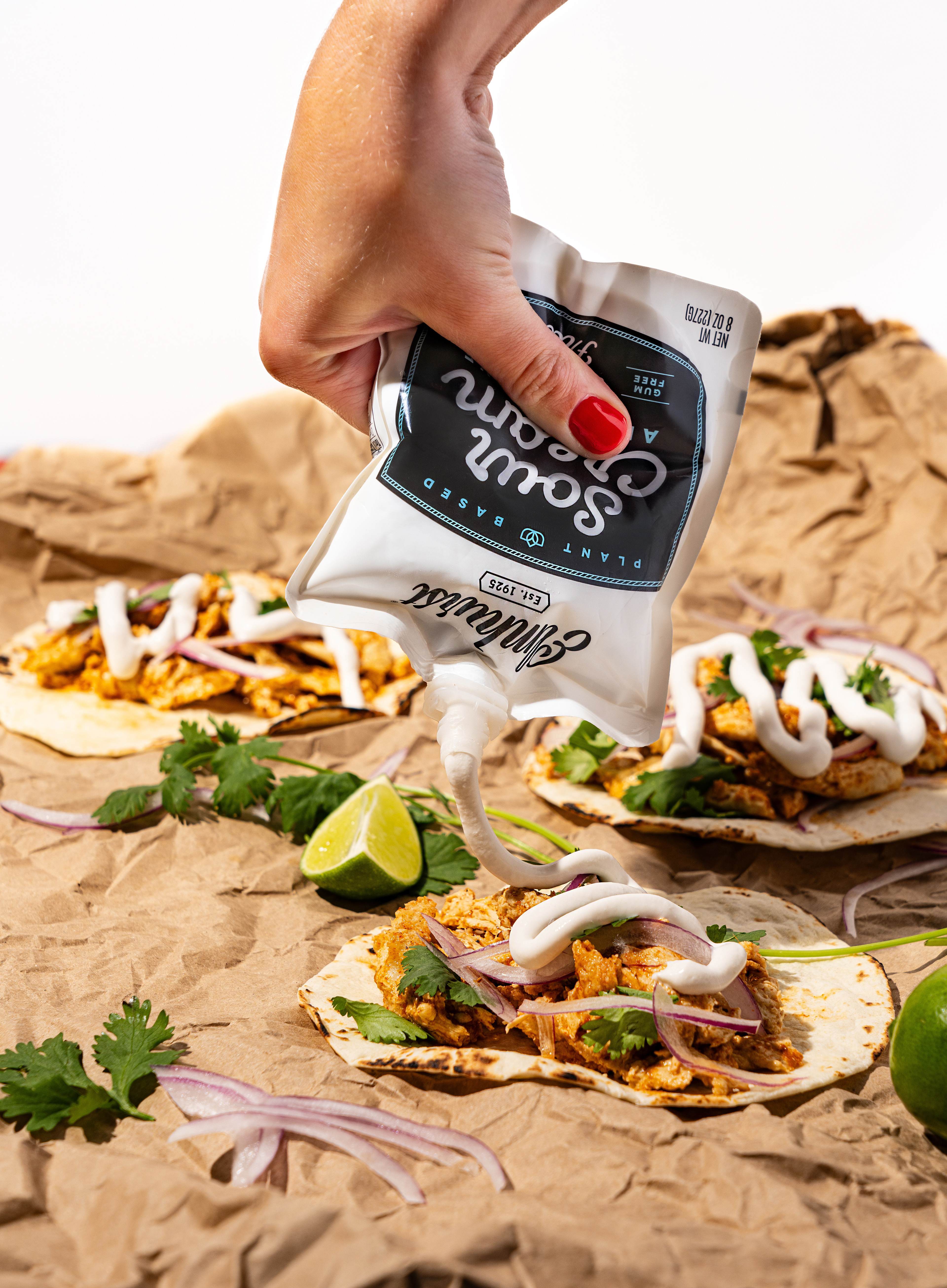
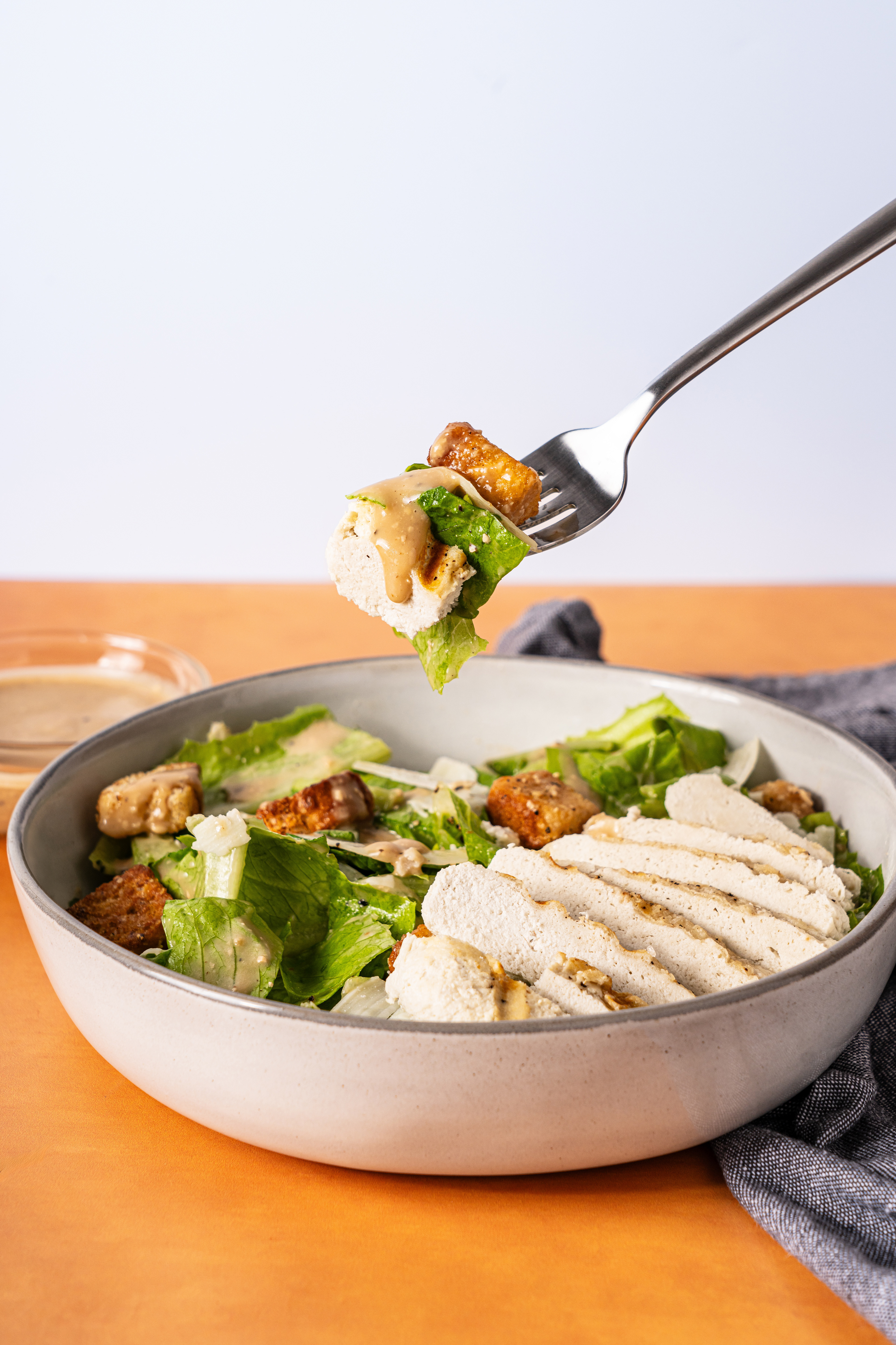
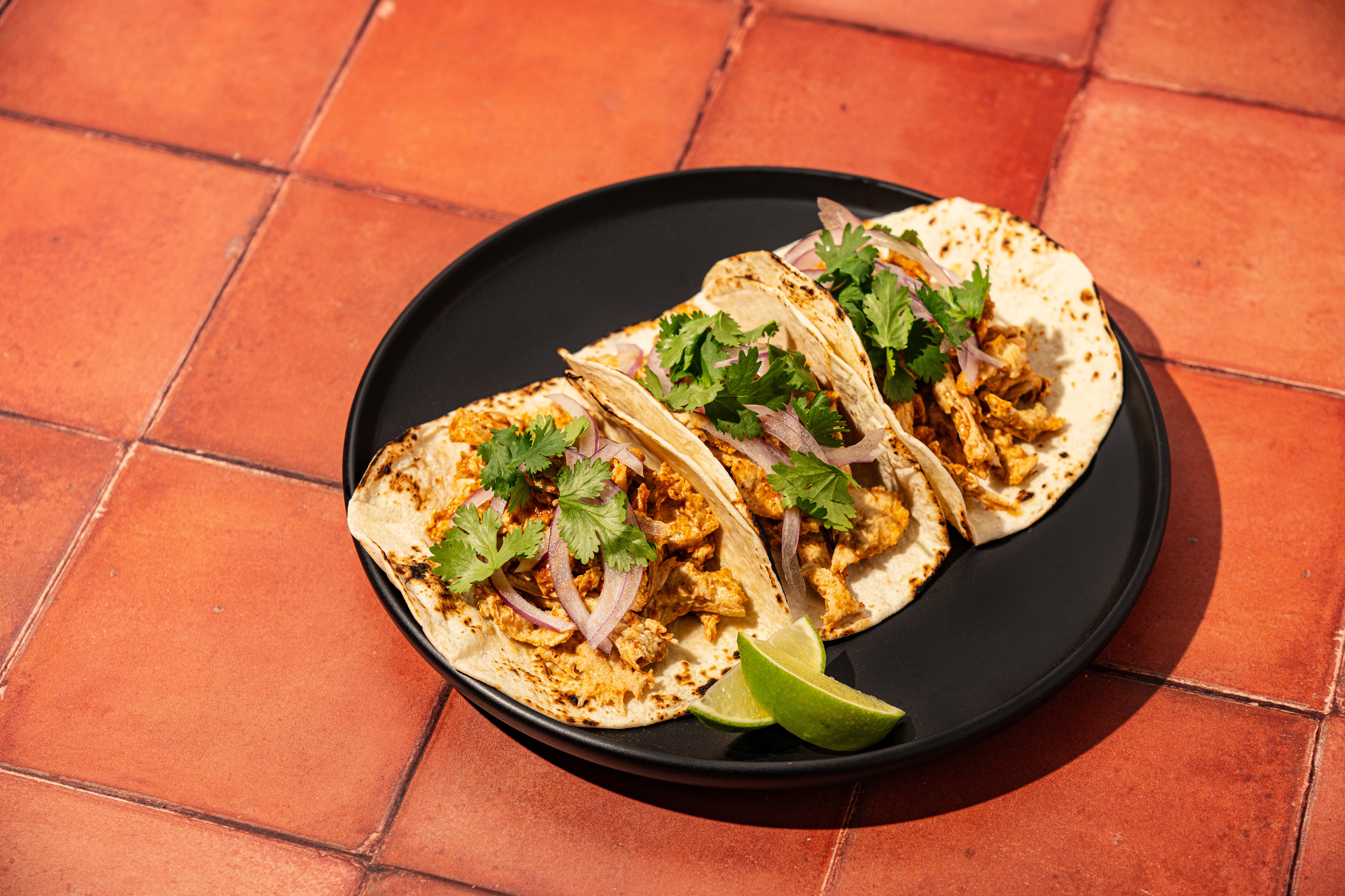
For the launch itself, I created a second 9 grid utilizing one of the product photos that shows the versatility of the product. This helped keep our feed from looking empty on launch. I also created a video to show off the reveal of the product and some of the main selling points.
Back to Top