This rebrand was for a hole-in-the-wall fresh pressed juice place in Toronto, Canada. I wanted to create a cohesive logo and brand identity that was fun, youthful, fruit-filled and colorful.
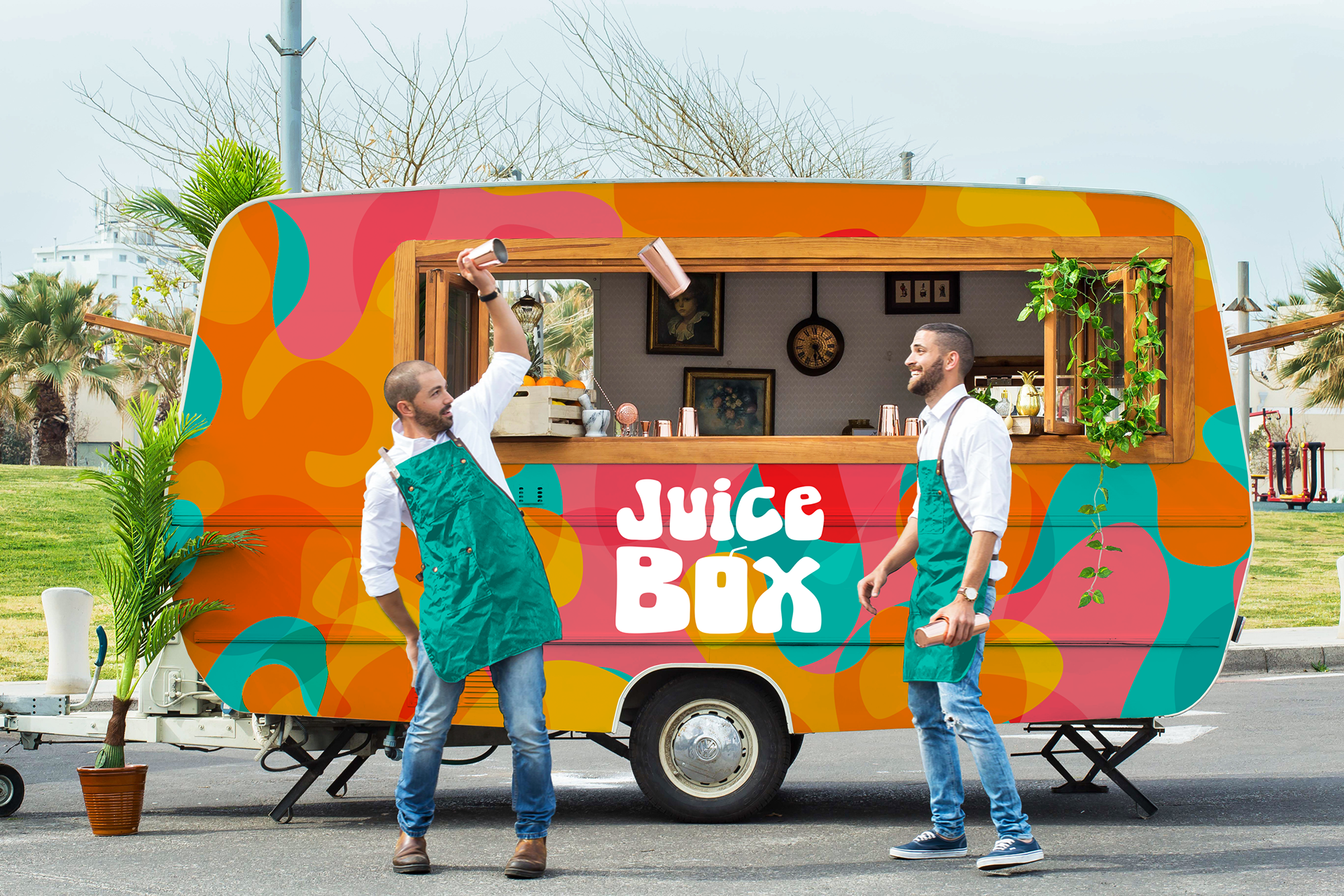



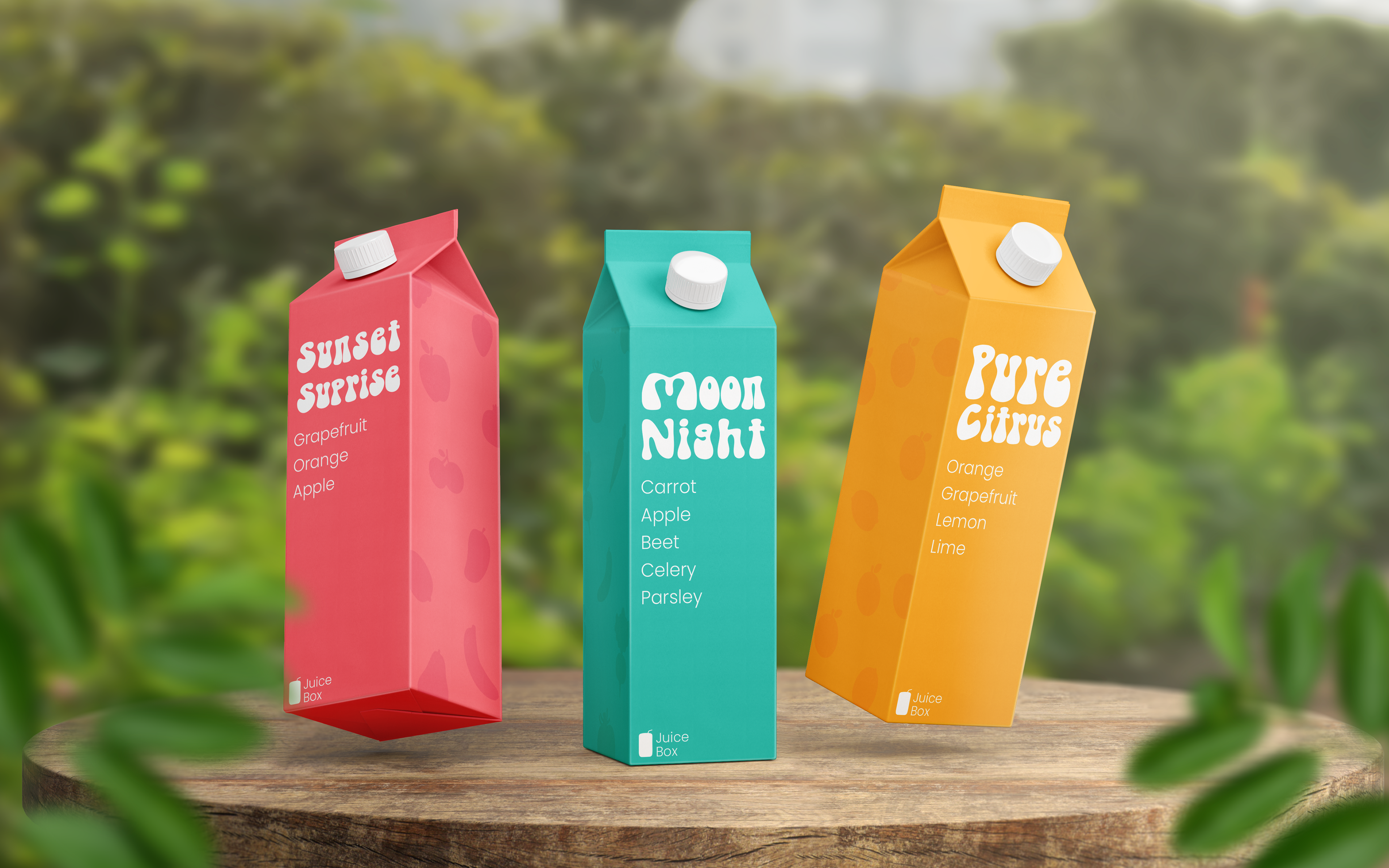
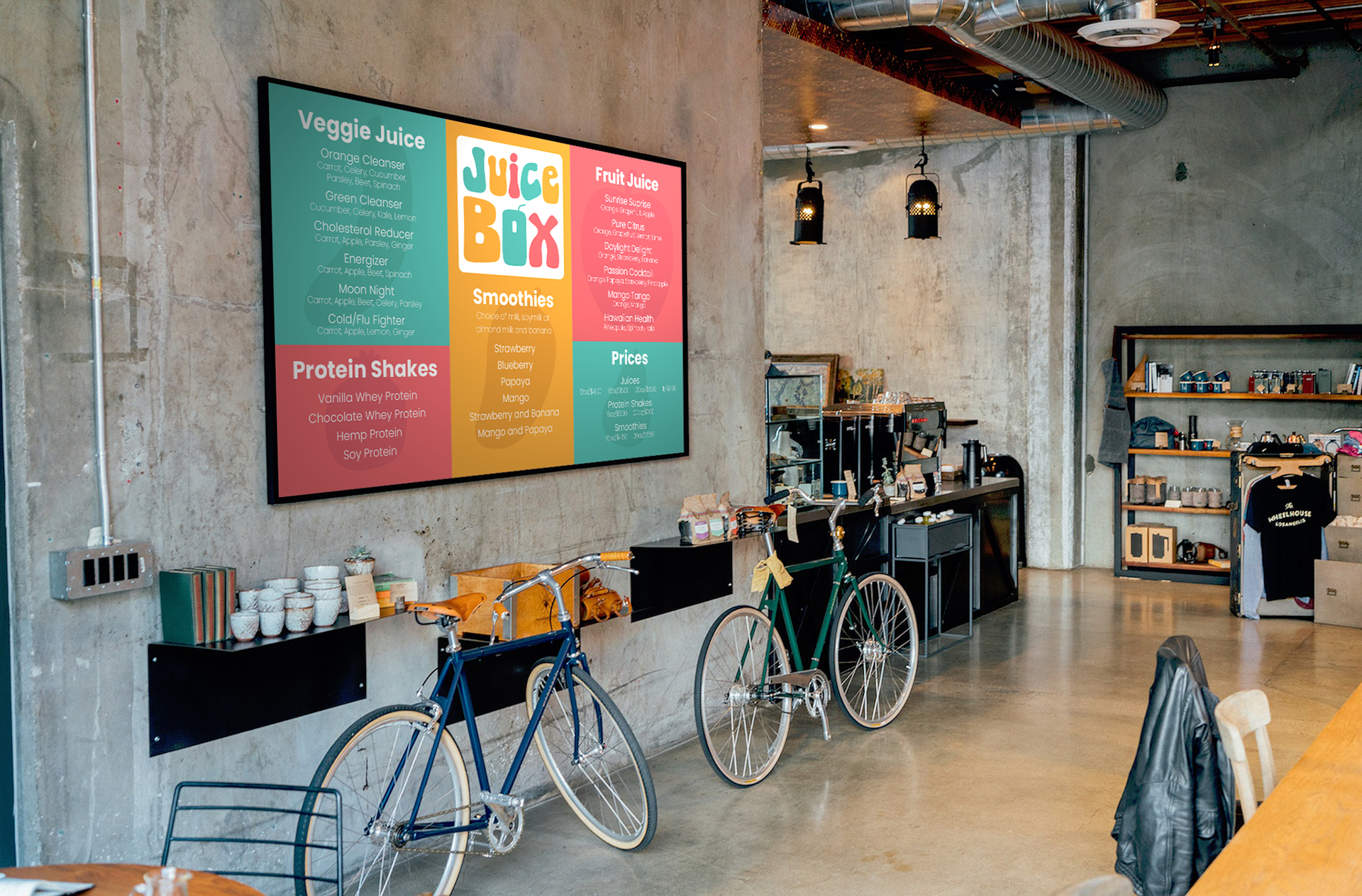
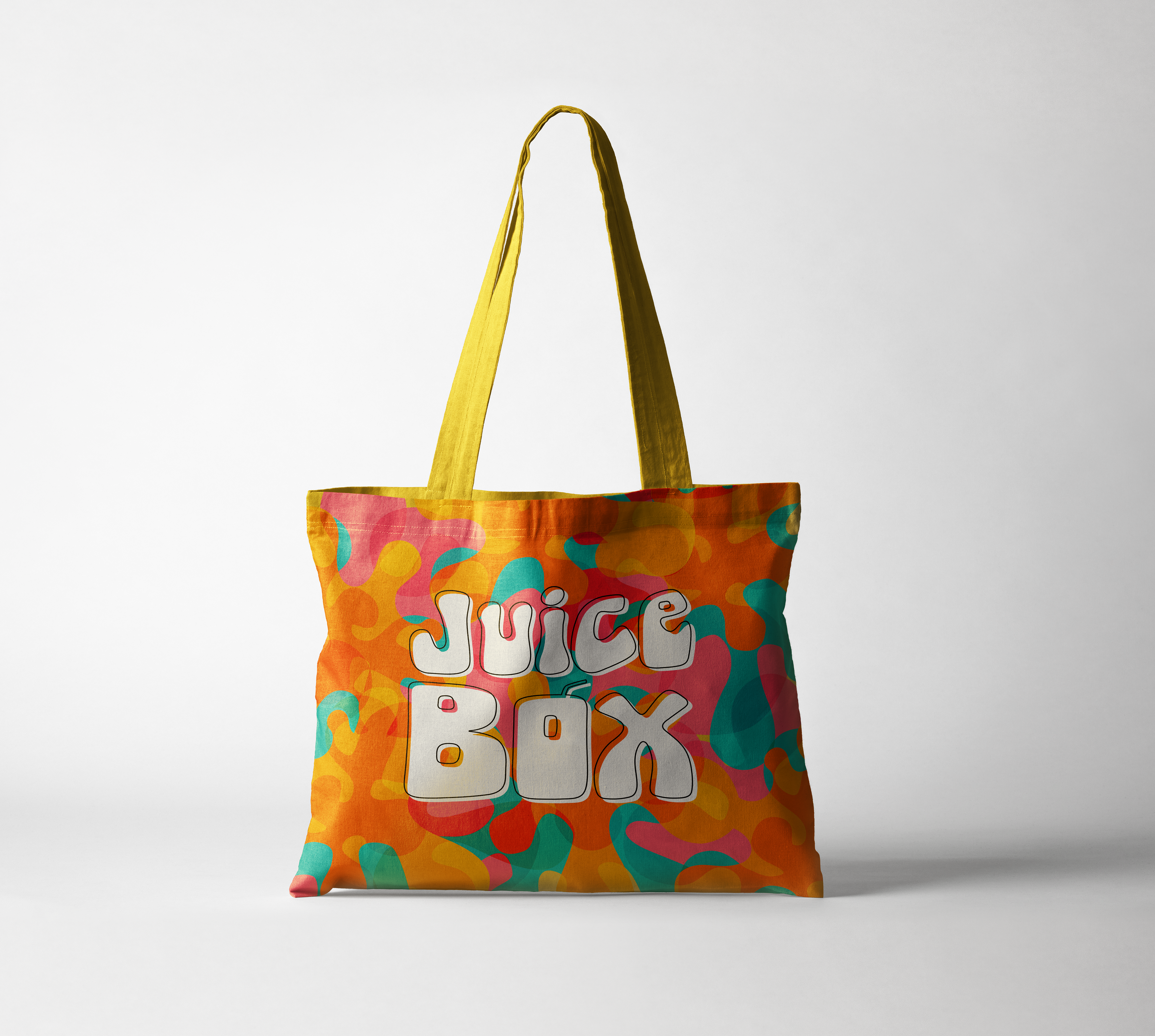
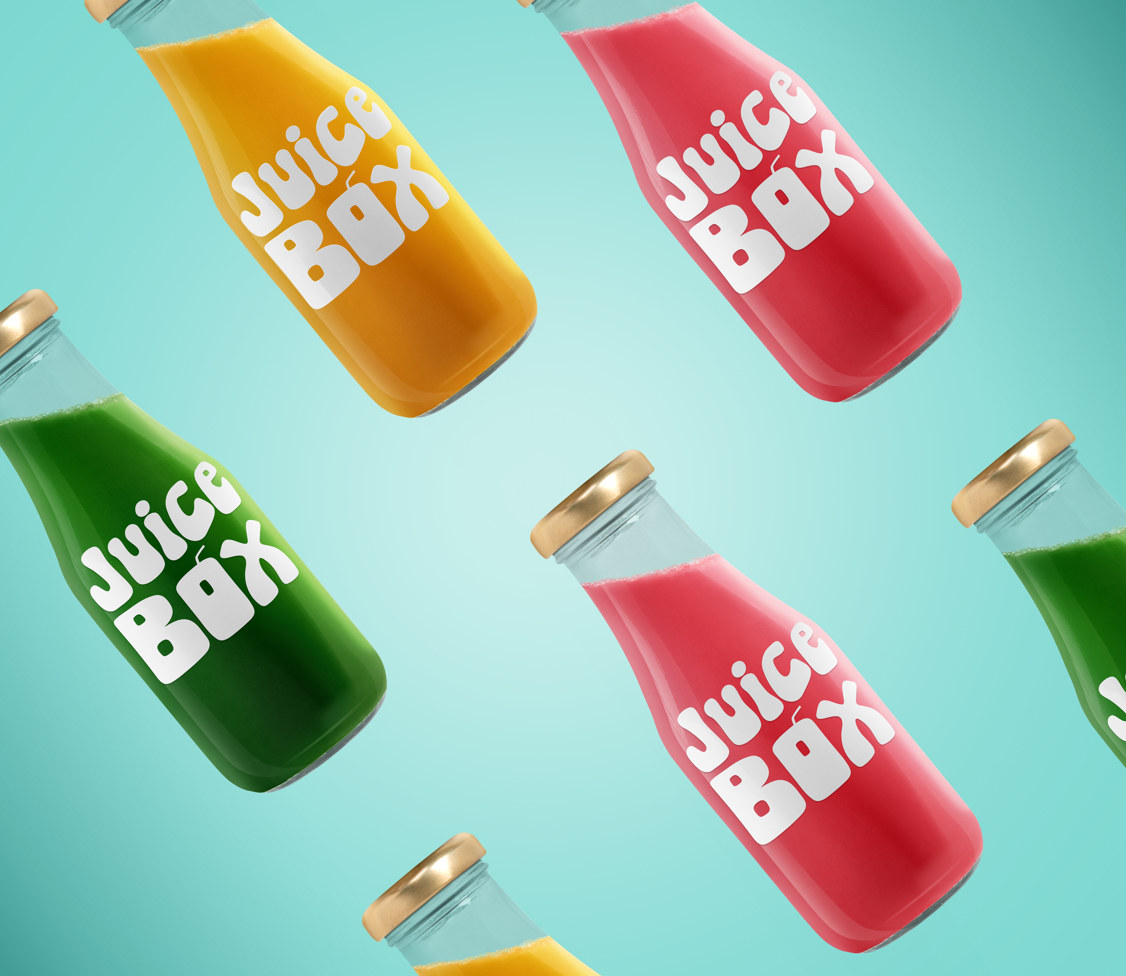
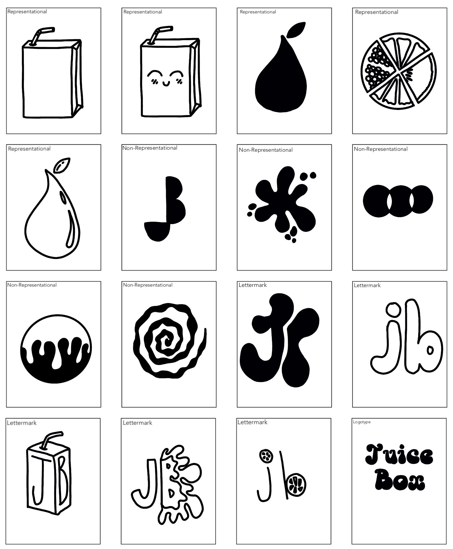
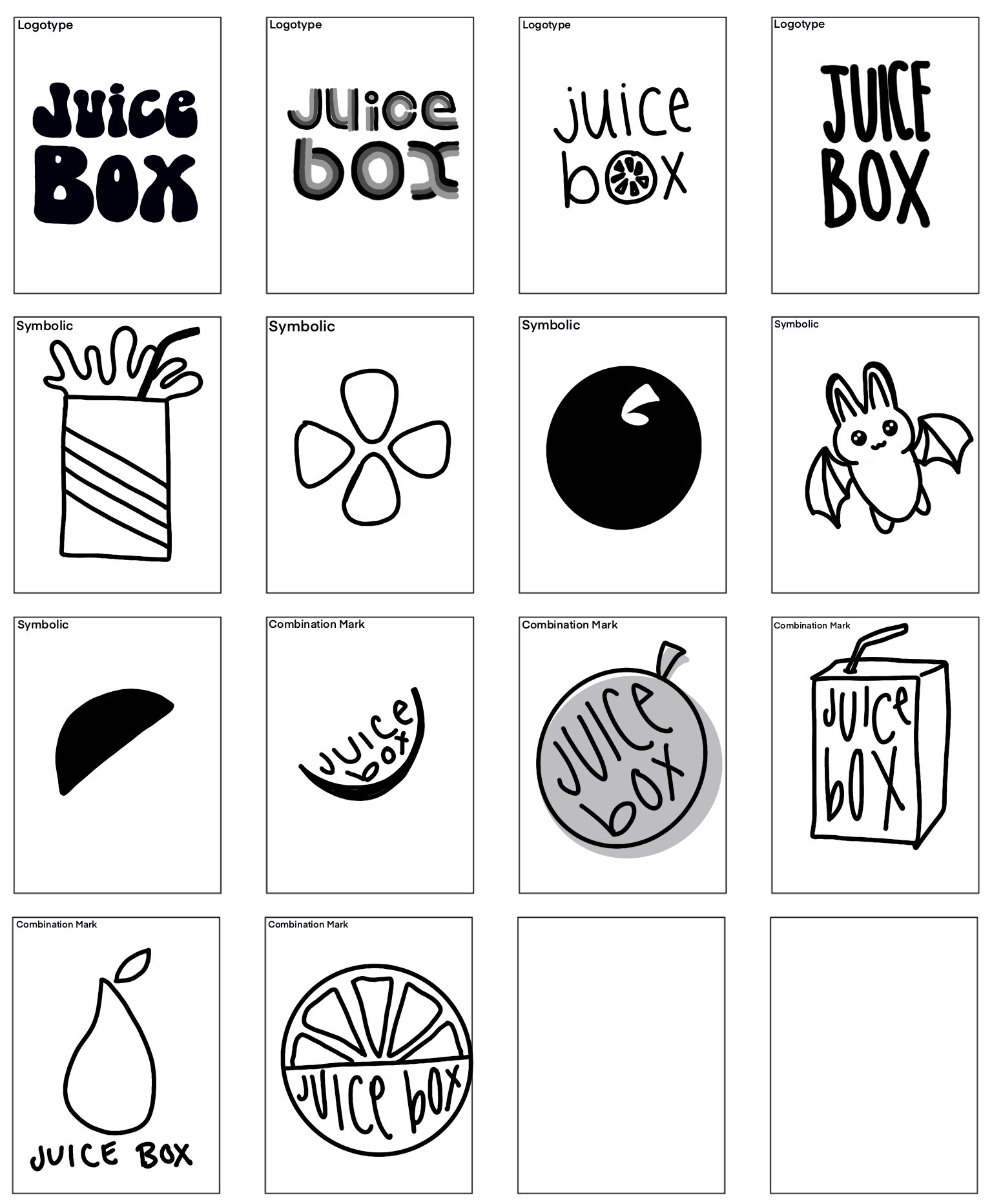
To start with this project I spent a lot of time sketching, trying to explore how a logo could look for Juice Box in different styles and types of logos.
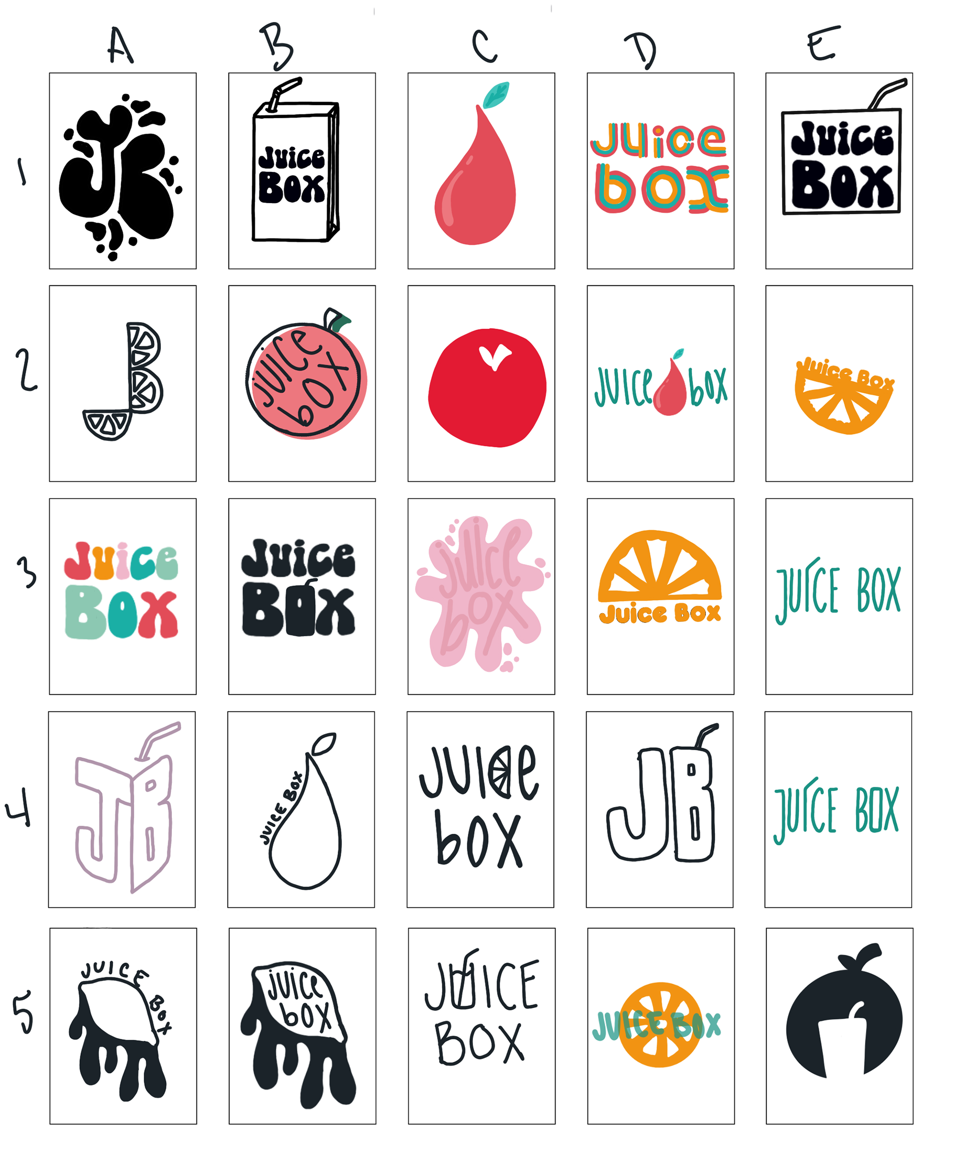
I narrowed down my logo choices to a top five that I felt represented the brand and would be successful as logo marks, and also to build out into a brand identity. I was able to begin the process of digitizing these sketches and continuing to refine them.
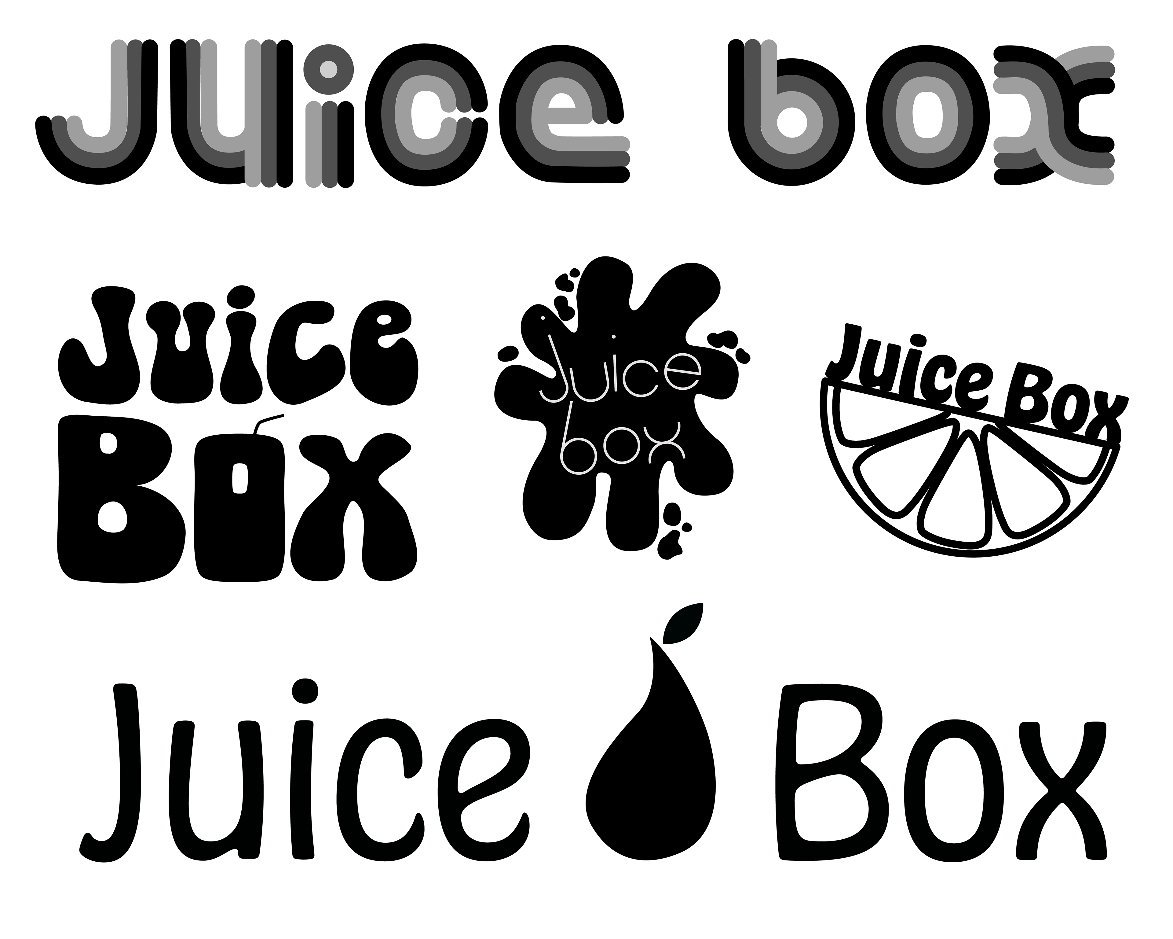
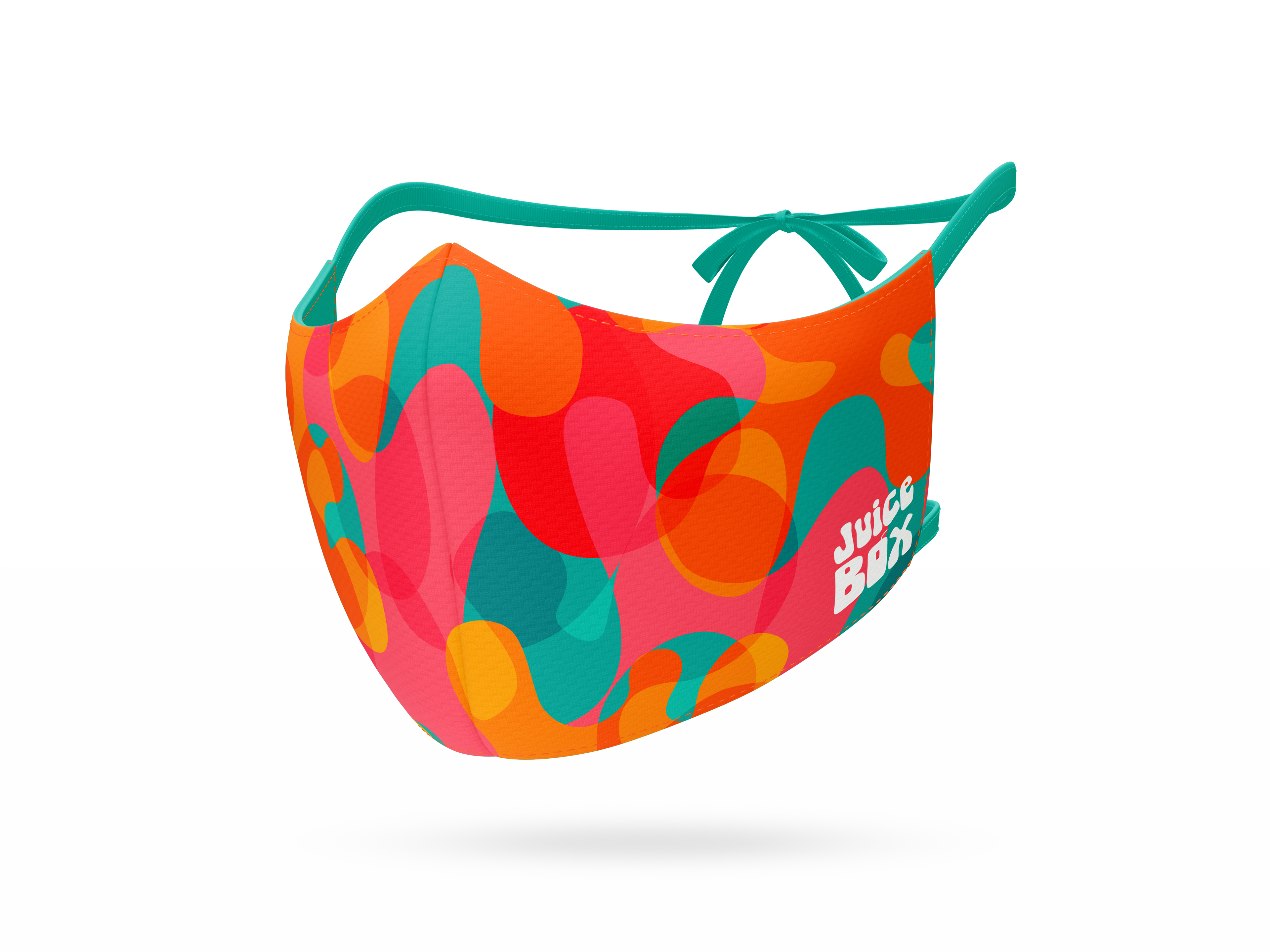
Once I decided on my logo and refined it, I was able to start picking colors, fonts, and additional branding elements. I knew I wanted bright, fruity colors but I also wanted to incorporate a cool color as they also offer a lot of vegetable juices.
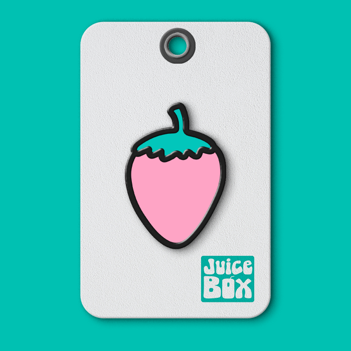
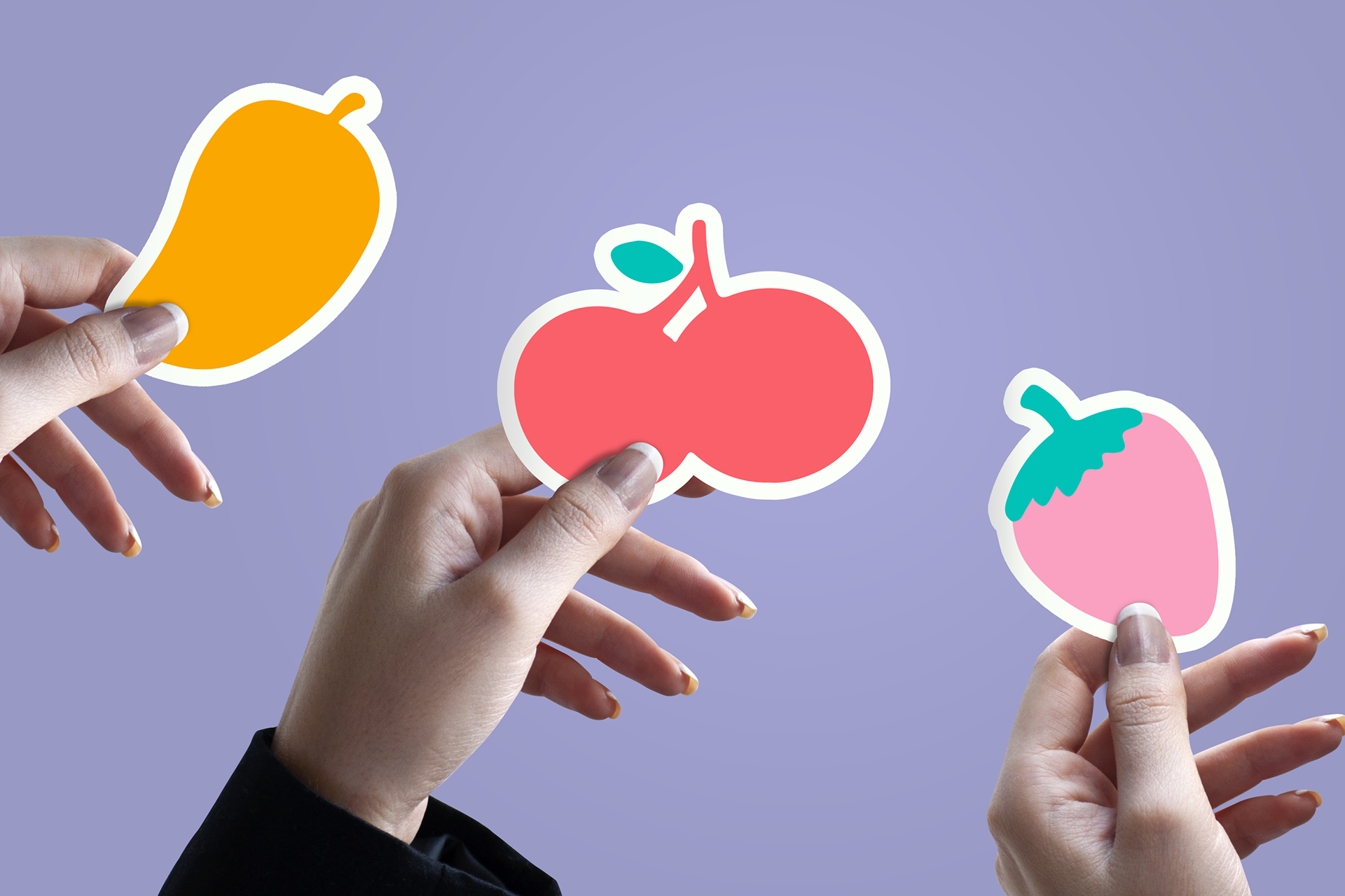
As a part of the identity system I created a bunch of fruit icons that could be adapted into a pattern as well as used as stand-alone graphics on items like pins and stickers. For the icons I expanded the color palette to add a little more versatility.
Within my identity system, most elements have a flat version, and then a version with an offset outline. I wanted to include this as an extra pop when needed, especially for use on things that are going to be seen larger and more up close, such as social media posts or on merchandise.
The main font I chose was used in my logo, and is also used as a headline font in other areas of the branding. It is a modified version of a font I found that was not very polished or cohesive, so each letter has been customized and in some areas completely changed to look more clean and uniform. The Shagadelic font does not work well very small, and is too busy for body copy so for a secondary font I used Poppins since it's clean and compliments the main font.