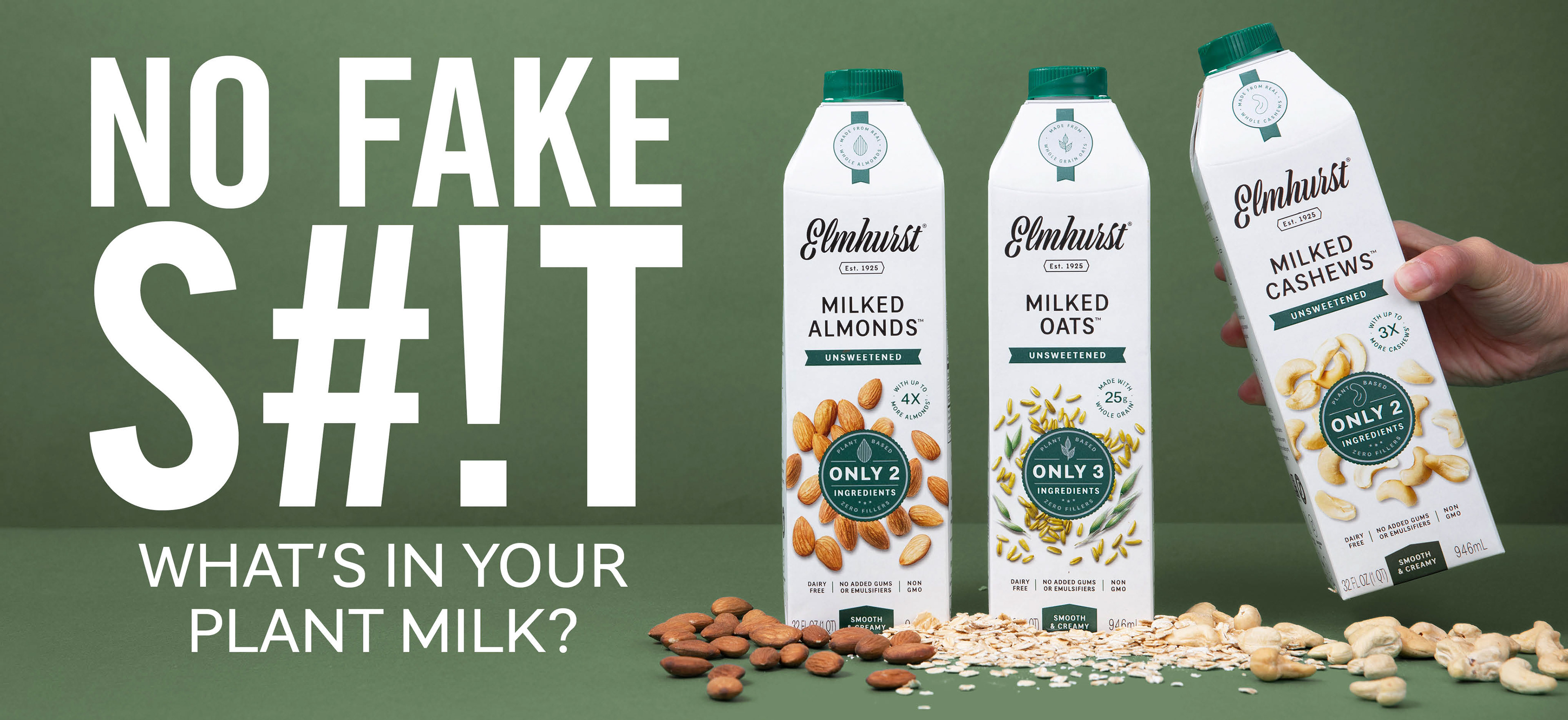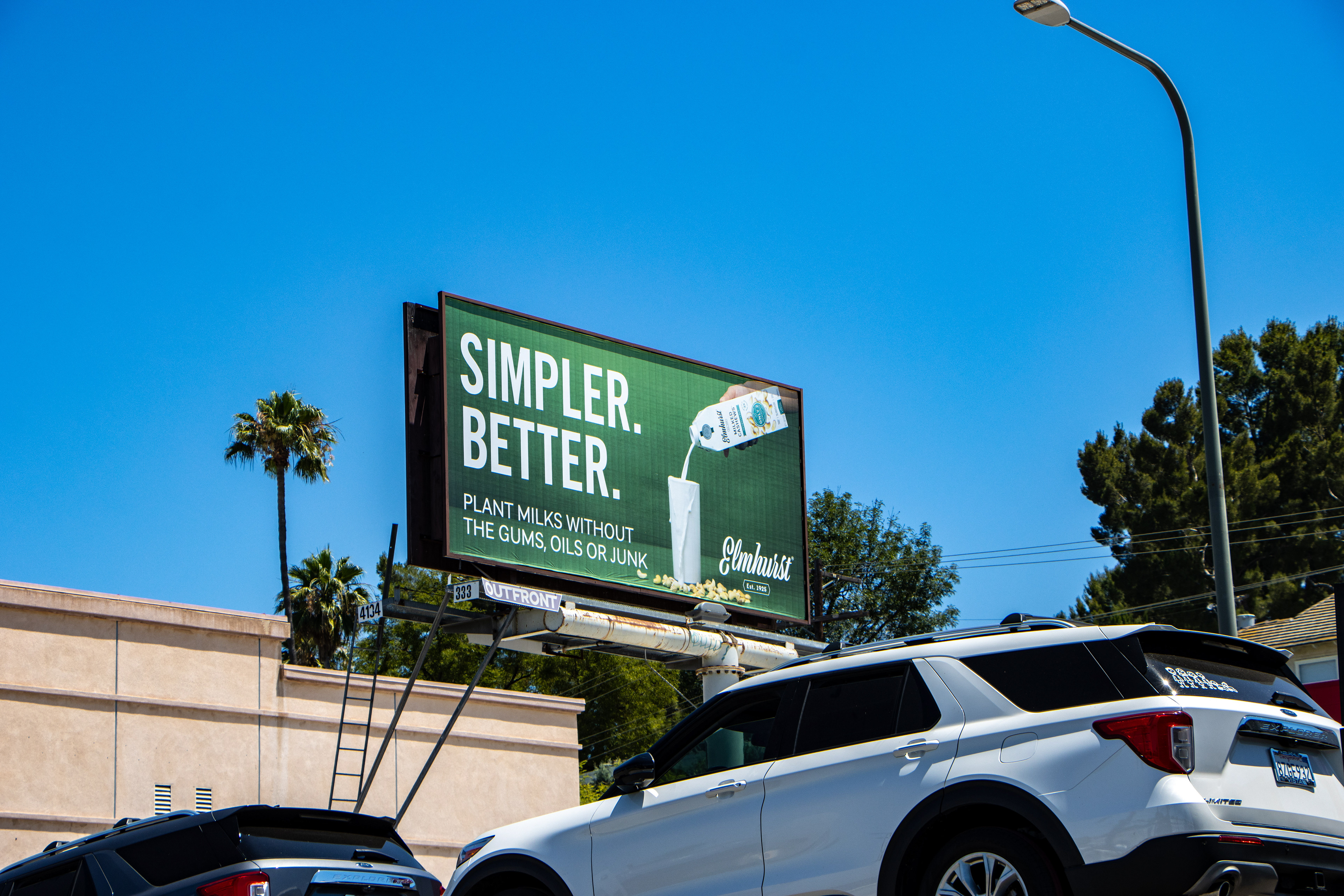
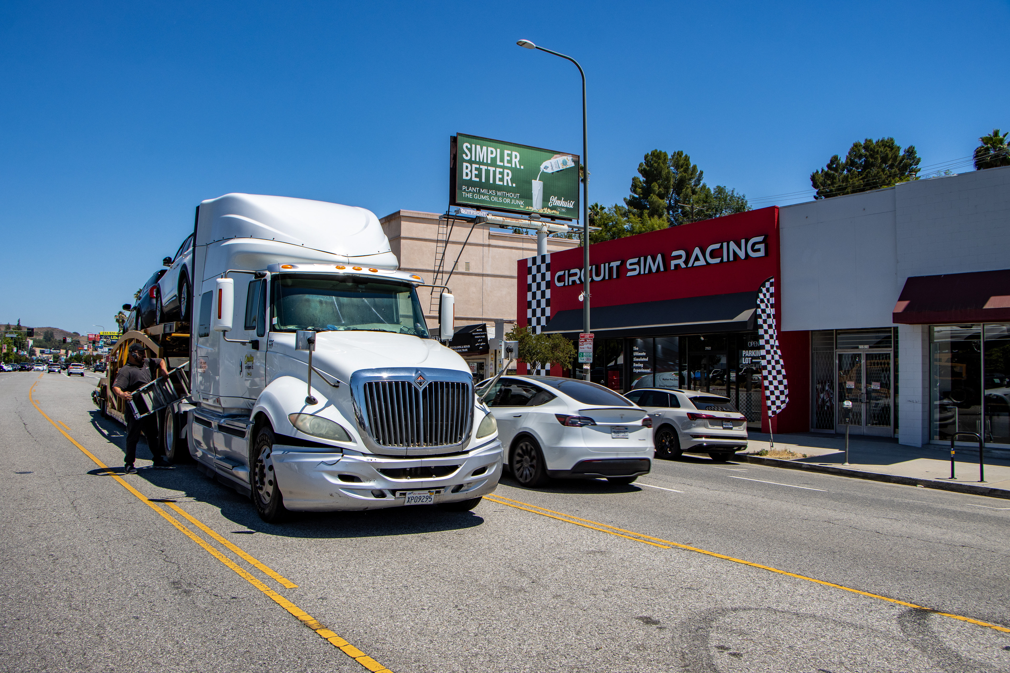
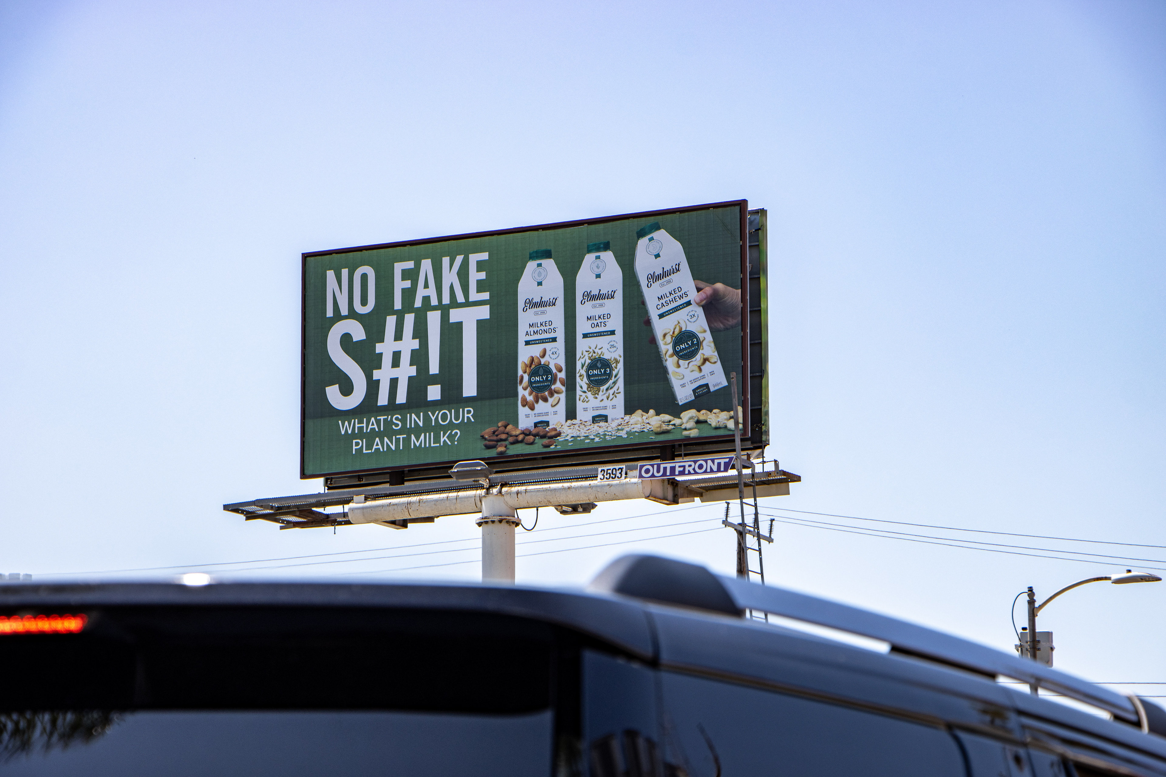
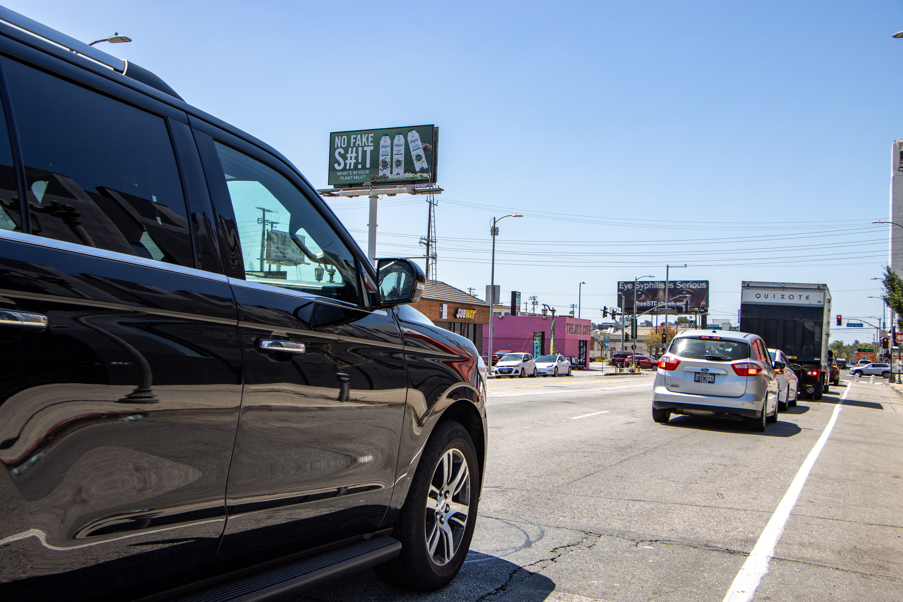
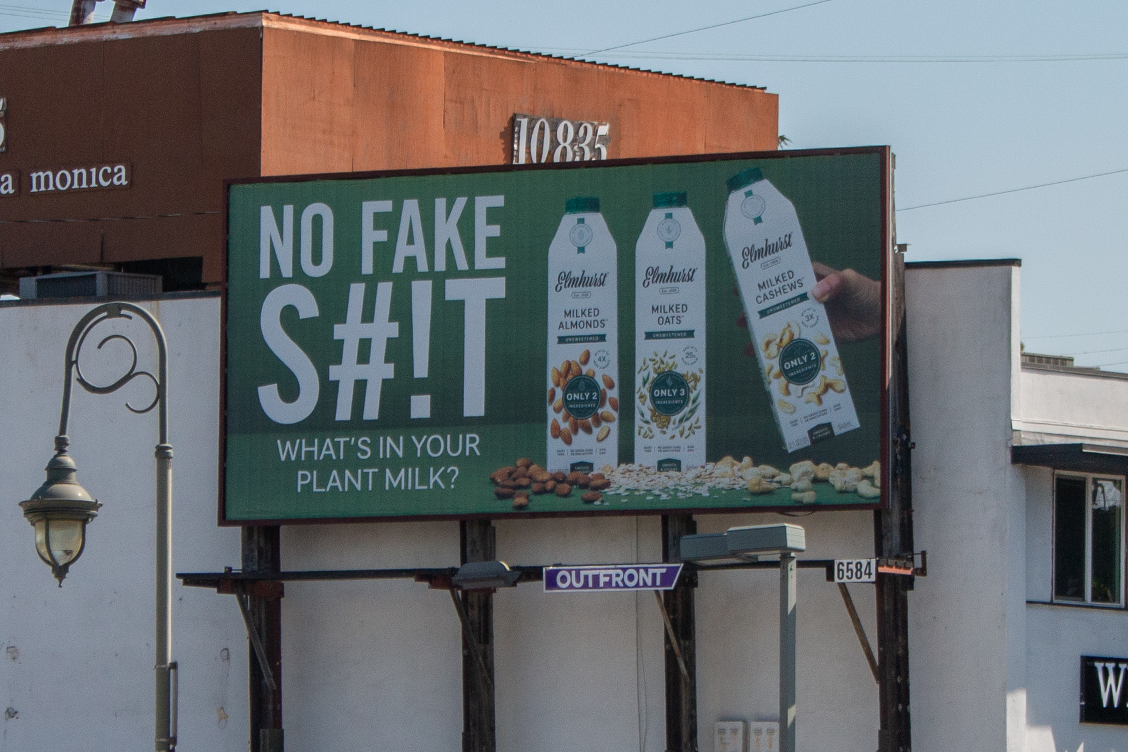
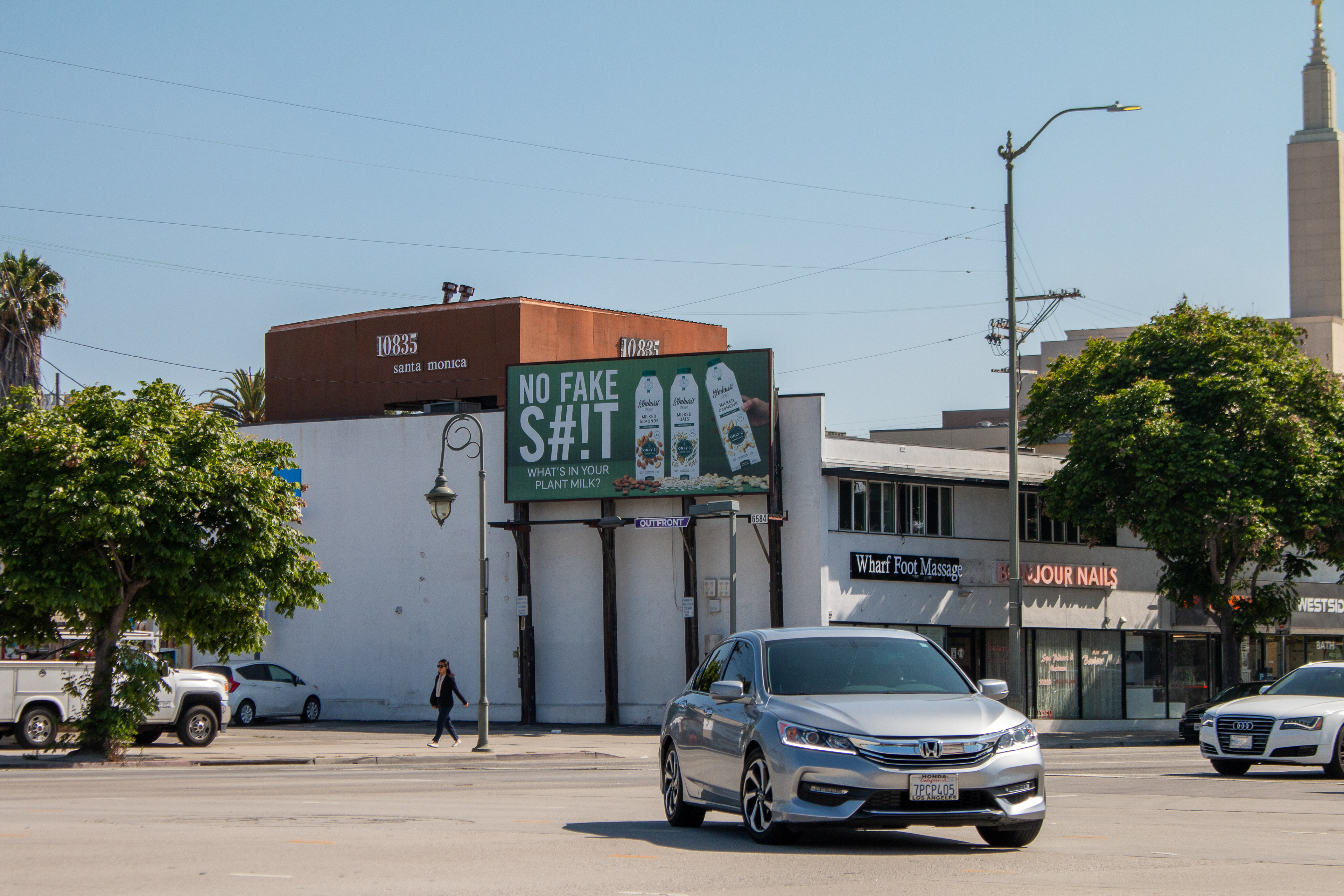
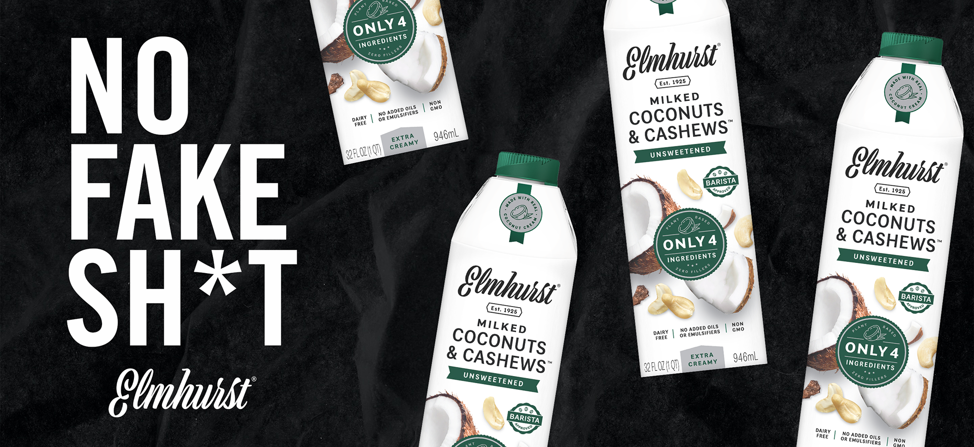
Project Overview:
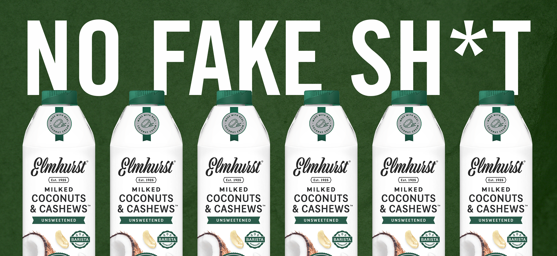
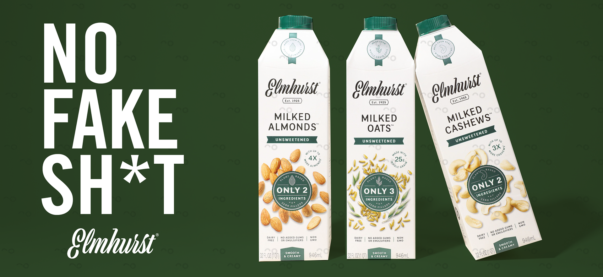
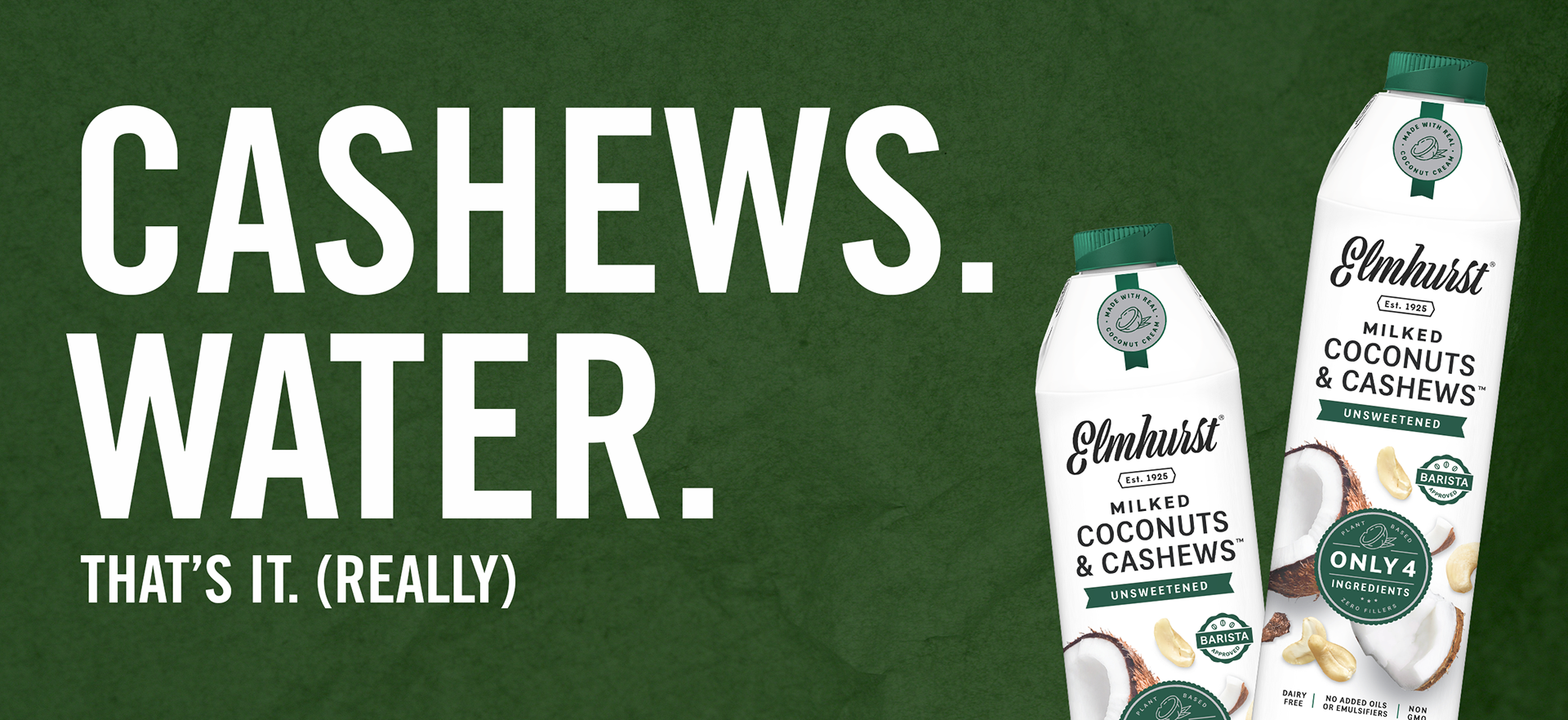
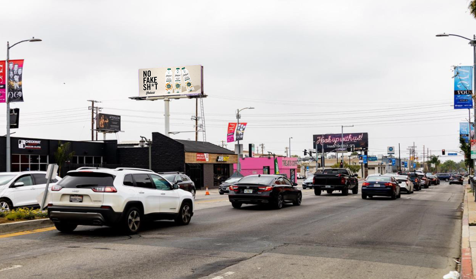
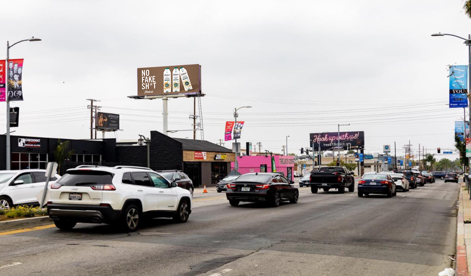
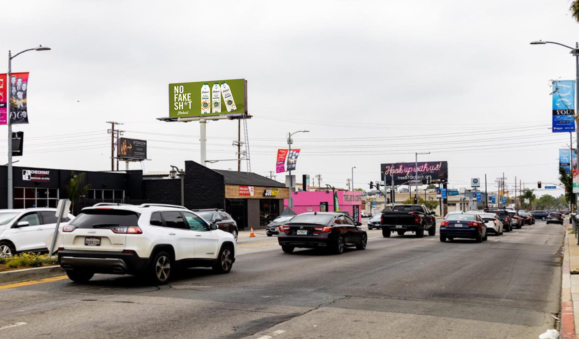
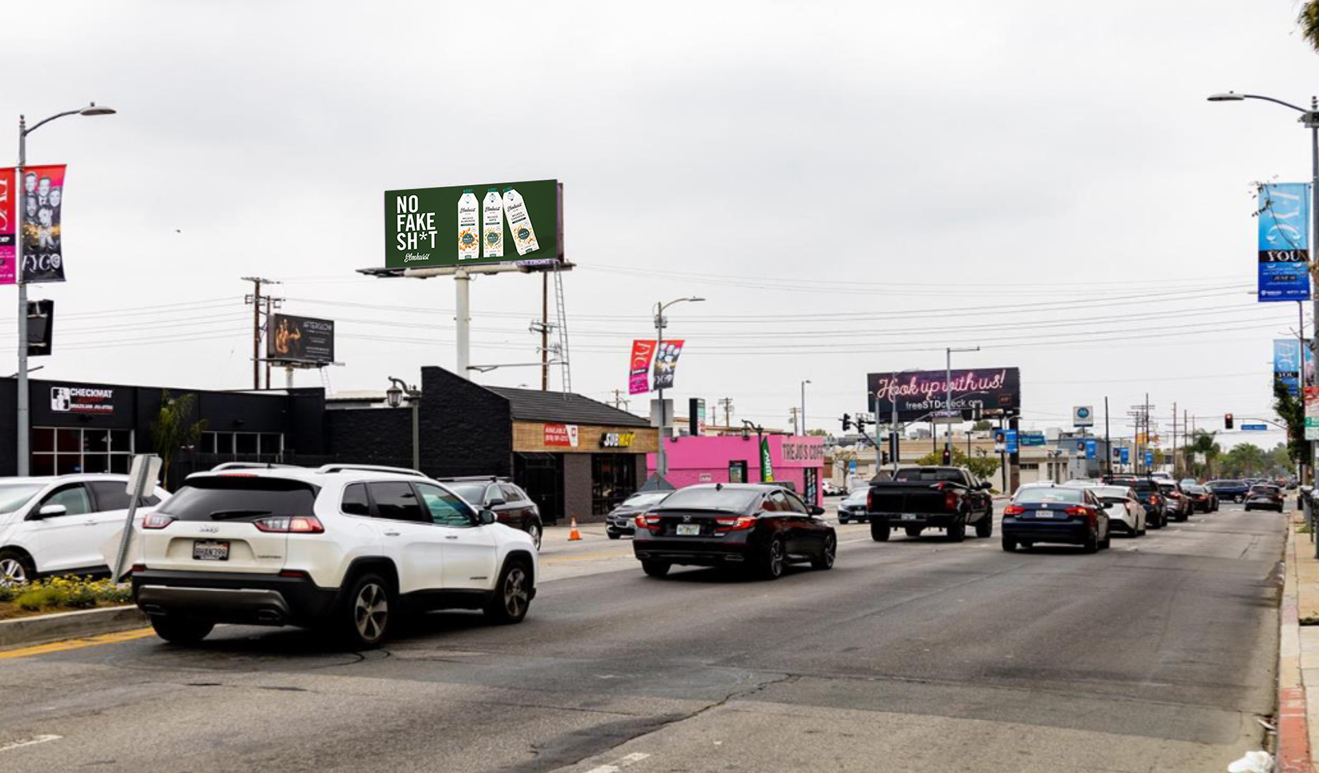
We purchased 4 billboard slots in Los Angeles to highlight our Unsweetened line.
Scope:
This project required creating two designs to be placed on billboards in Los Angeles.
My Role:
This project was brought to me by our marketing team with only a loose idea of what they wanted the final product to look like. I was able to have free range with proposing concepts, directing and executing the photography, and designing the final product with the input of the team.
Process:
I knew I wanted to keep these designs really clean and simple. With billboards it's important to be able to capture the information and message when someone is viewing it at 60mph driving on the freeway. I looked at other successful billboard designs to make sure I understood what would work well and used that as my guide for what would and wouldn't work. I started off by presenting a few different directions to the team to see what everyone felt best represented the brand and the messaging we wanted to portray. At this point the team hadn't narrowed down what copy we wanted to use.
Process:
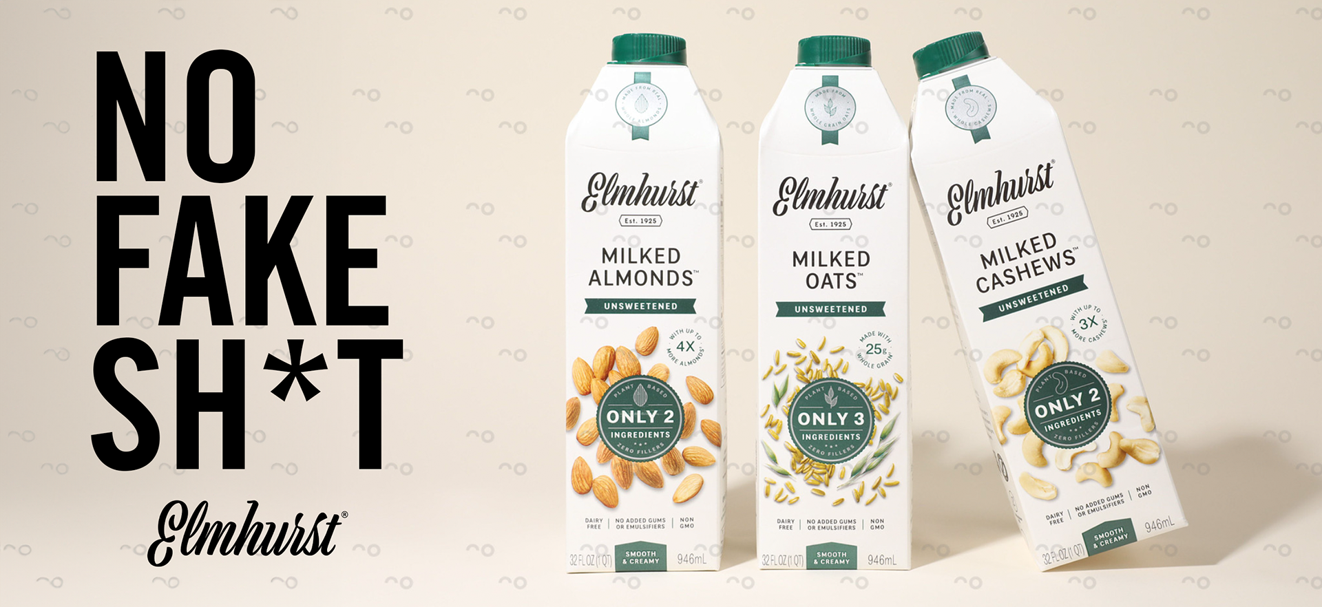
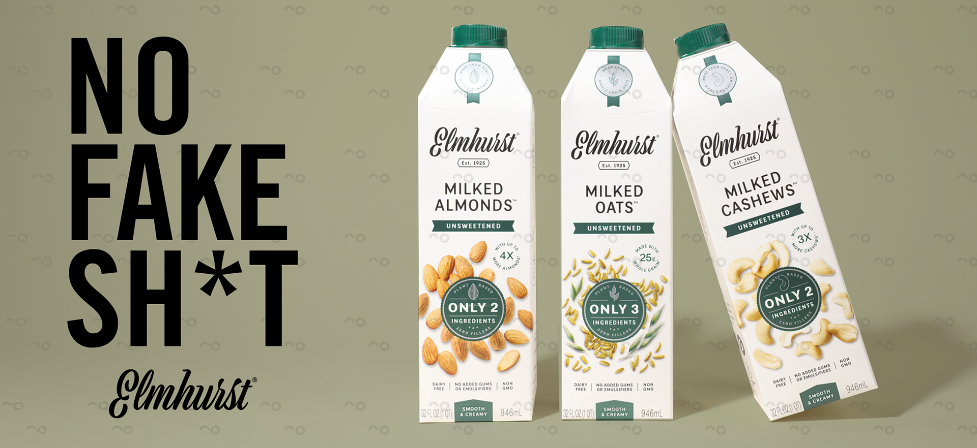
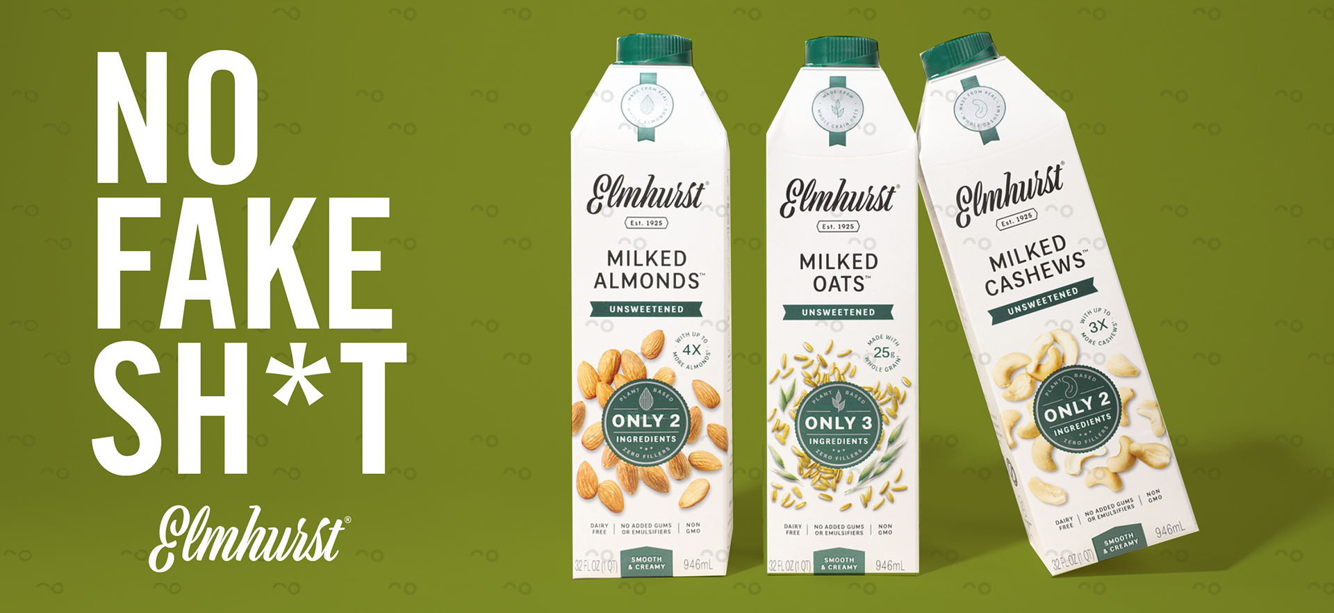
The feedback was pretty universal, my opinion included, that the option of a super clean, minimal lifestyle photo pairing with a bold copy line was going to be the way to go. From there I mocked up some options of the two product compositions I wanted to photograph and showed the team some options of background colors so we could take the real photos. This was important for helping the team understand which background colors might work best and which might not, especially factoring in the billboard surroundings and the importance of contrast so the product stands out.


Final Design:
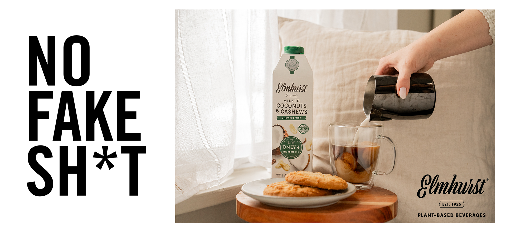
We landed on our signature dark green as the background color as it offers the best contrast between the bottle and also the environment that surrounds the billboards. It also is a nod to the signature cap color. I was able to utilize the teams feedback on the various mockups to direct a photoshoot so we had fresh, high quality photos for the billboards. We did make one noticeable change at the end of the process when we learned that our copy could not be approved using "SH*T" and had to adjust to something that only showed two letters of the word, cause sometimes that's just how S#!T goes!